

Early during our conversations with Heads Above the Waves, one of the recurring values they needed from a new identity was ‘personality’. The Heads personality is unique and when faced with the challenge to truly communicate a brand’s values, bespoke typography became a key area we can distinguish the identity.
Over the last 5 years, large brands owning their voice through type has become pivotal to transforming how brands speak to their audiences. A brand’s tone of voice can talk the talk, but an own-able typeface will always walk the walk; sometimes more than a logo or signature palette can.
We were lucky enough to have the opportunity to give Heads Above the Waves a typeface that can truly be their voice.
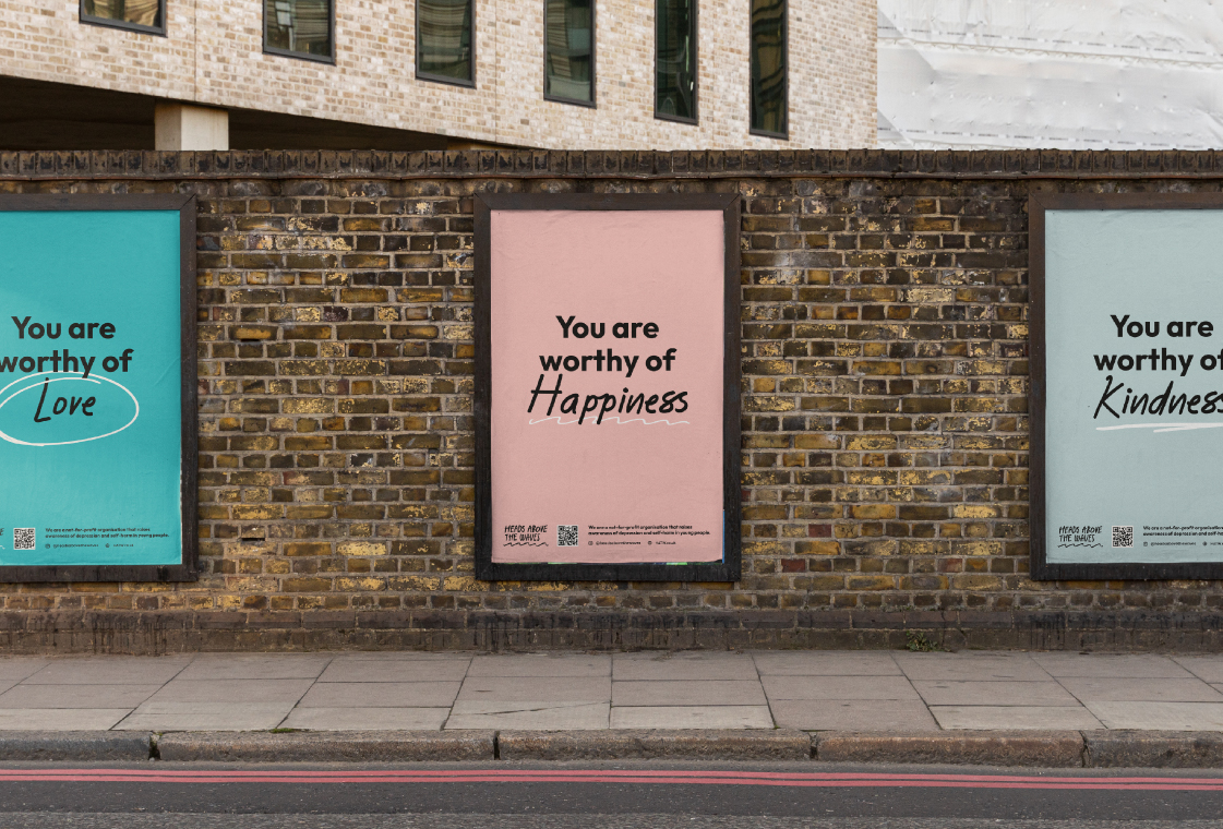
Heads needed a typeface for a variety of reasons. In their former brand, they found great success in using a script font to add areas of personality and are often handwriting notes to their customers. Our proposed script-based logo revision and hand-drawn marker elements were baked into the brand’s DNA, so a bespoke script typeface was beginning to form neatly into the picture.
We started by collecting their handwriting via a series of basic pangram documents. Writing out letters individually often leads to overthinking and we needed to capture the true essence of Si, Hannah and Bethan’s handwriting.
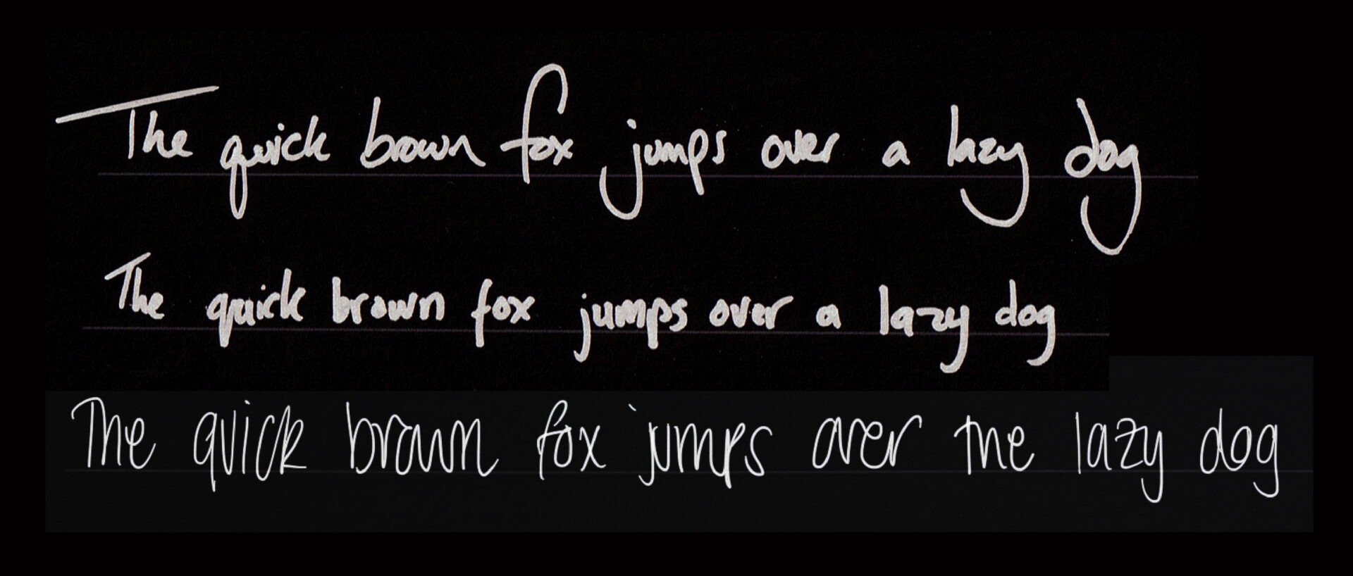
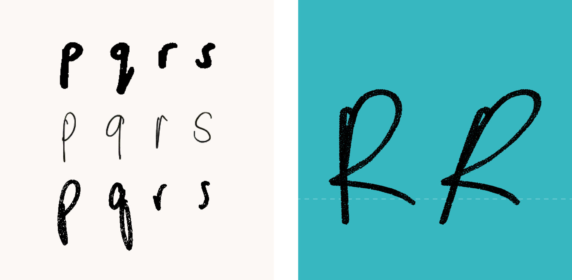
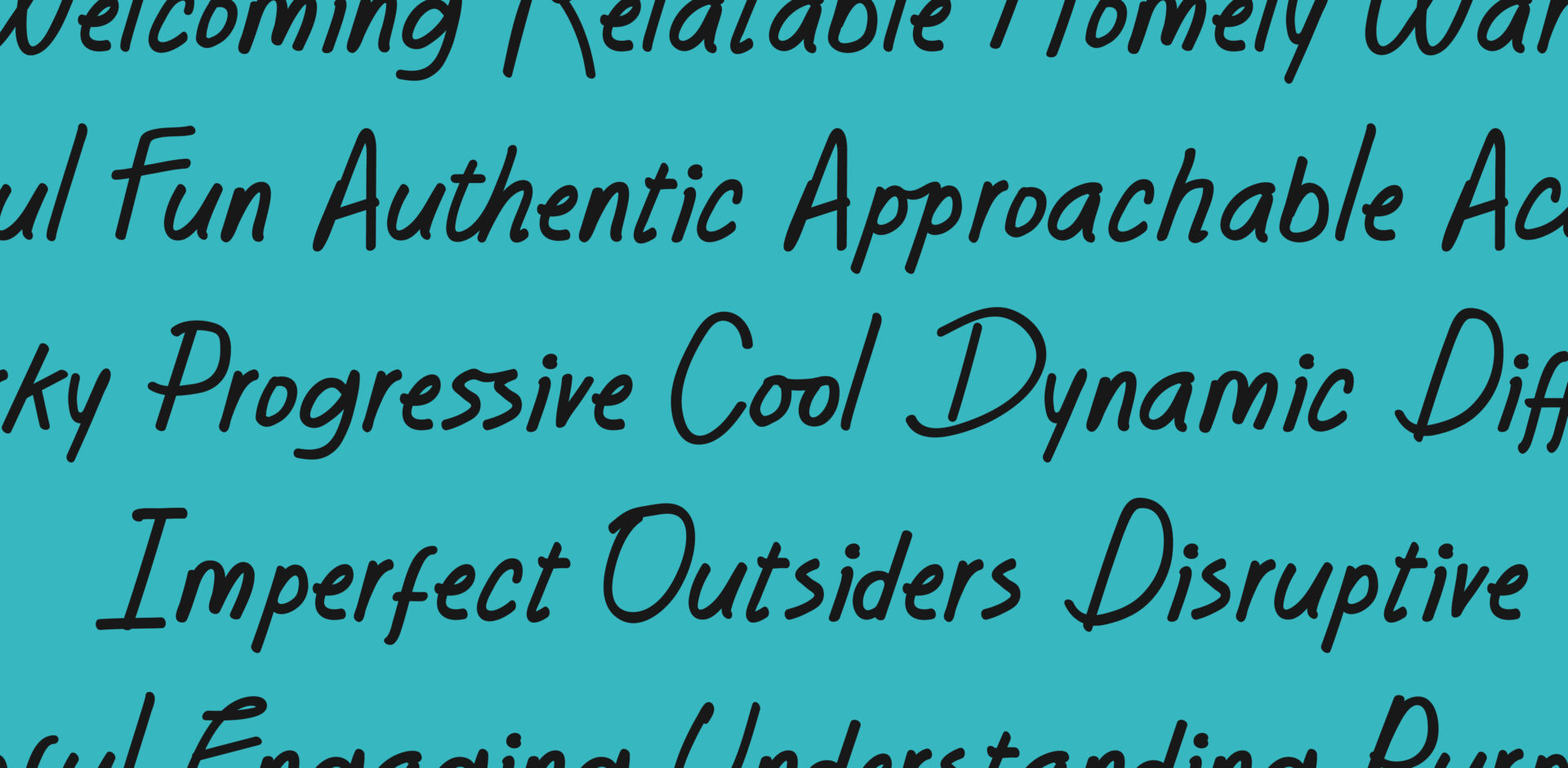
We then took their handwriting, extracted each letter out individually and scanned over the alphabet for key characteristics that we can combine into one universal typeface. We knew from our early development phases that Outfit Bold was locked in as the heading font and various script typefaces we trialled with Outfit were all slightly italicised. This led to warping some scanned-in characters into italicisation; adding a sense of rawness and forward momentum.
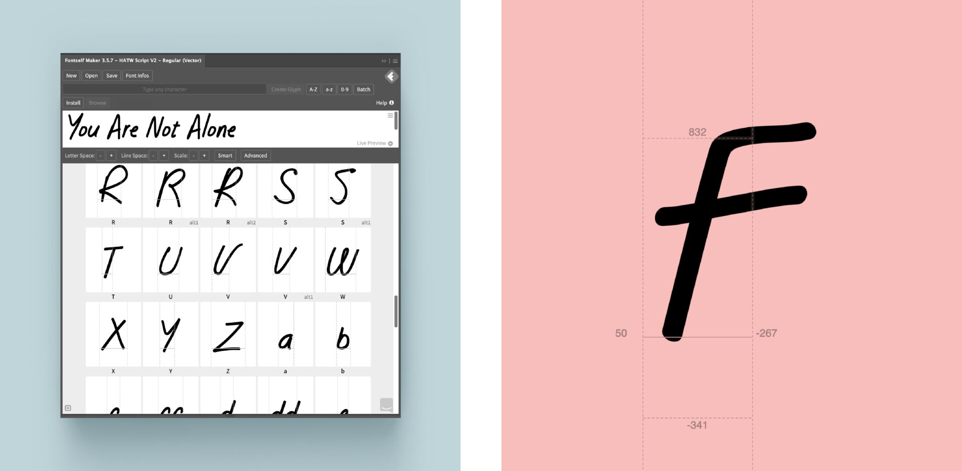
If you’re not aware of FontSelf, it’s a simple but thorough plugin for Illustrator and Photoshop to create your own basic typefaces. As a first foray into typography manufacture, it’s incredibly easy to get to grips with and served well in crafting the legibility HATW Script.
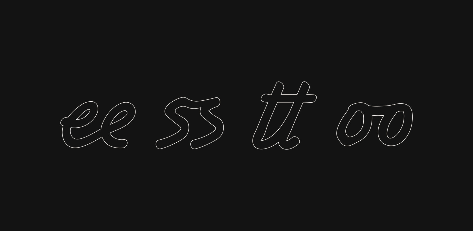
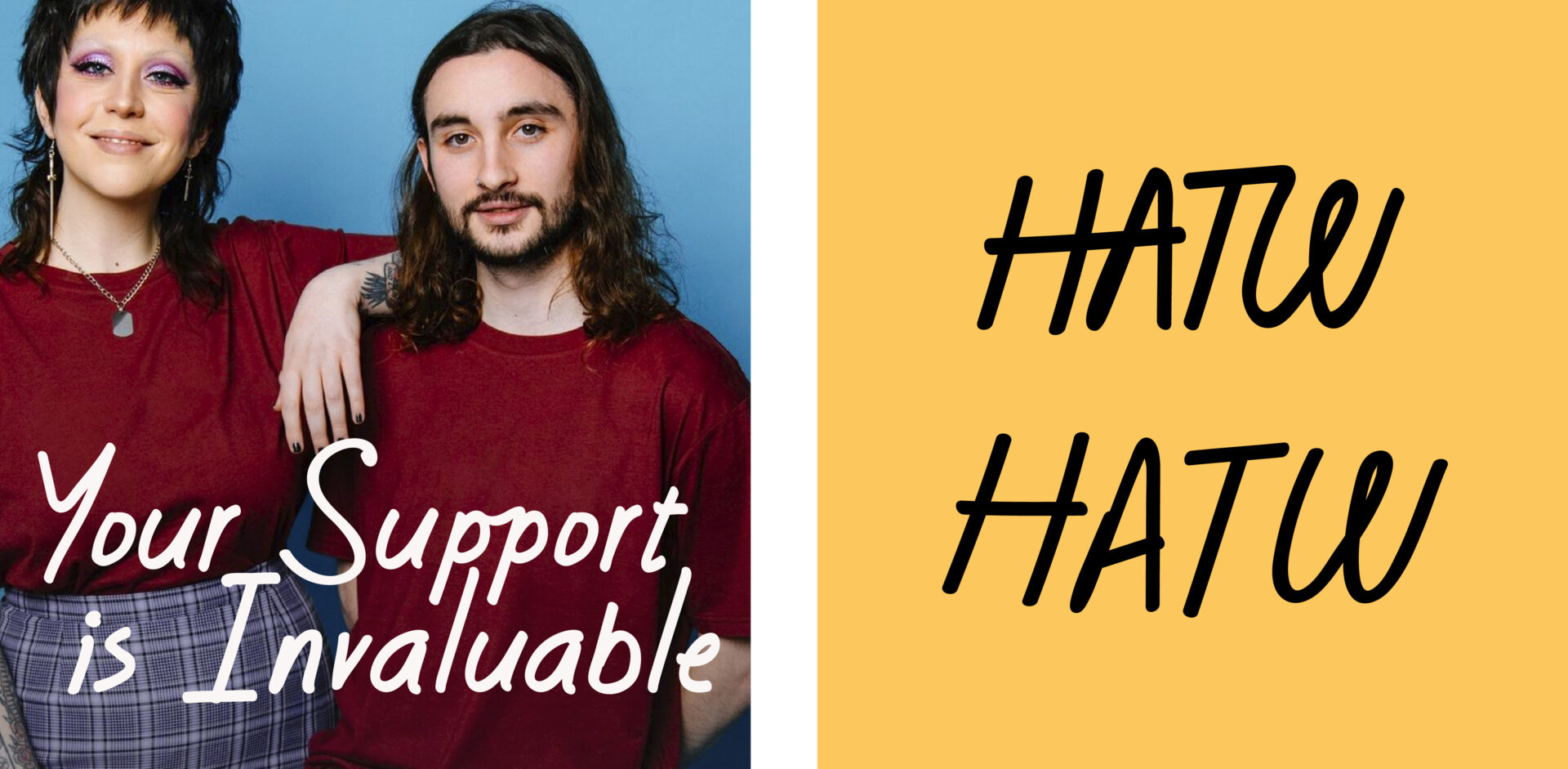
A key area we really wanted to dive into was interjecting ligatures and glyphs to many of the letters so that each usage of the HATW Script has a consistently fresh feeling. Some script and marker fonts tend to avoid ligatures to make the roll-out and usage as basic as possible, often leading to a sense of roboticness especially areas of double-lettering.
Creating a typeface is exciting. To bring to life someone’s entire personality and values encapsulated into lettering is also very daunting. Script typefaces in particular are a great introductory experience for any designer who wants to really make their mark on a brand identity.
Overall we aimed to create a completely functional and emotional experience, but the process of building a typeface can sometimes be tedious and time consuming. No one letter is as important as how that letter fits within the grand system of the type. A guiding principle with any typeface creation is a series of values and emotional objectives that ultimately lead us to constantly question ourselves. For us, we asked “Does this have personality? How does this feel?”. This sense of constant introspection is challenging, but the wider goal will always be ultimately more worth it.


