Heads Above The Waves

Heads Above The Waves

HATW is a not-for-profit inspiring young people with creative ways of dealing with bad days.

Helping young people navigate the complexities of depression and self-harm is HATW’s number one priority. More young people suffer from mental health challenges in their daily lives then ever before and there continues to be a lack of funding and support to effectively engage young people on their level that is accessible and relatable to them.

HATW discuss these challenges in a unique, engaging and positive way that normalises the discussion around depression and self harm. Reminding people that they are not alone, while actively brightening people’s day and helping them to understand their challenges better through providing helpful and supportive coping techniques. Our involvement was to understand these complex issues and needs better and create a new visual approach that was relevant to young people.

Having matured and grown as people, HATW realise the importance of the work they do in the local community in Cardiff and beyond. We needed to build a brand that actively reflected authentic experiences and stories, one that they could evolve with and help them expand, meeting more people’s needs in a more effective way.

The Outcome

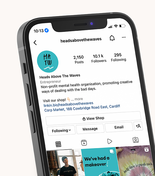
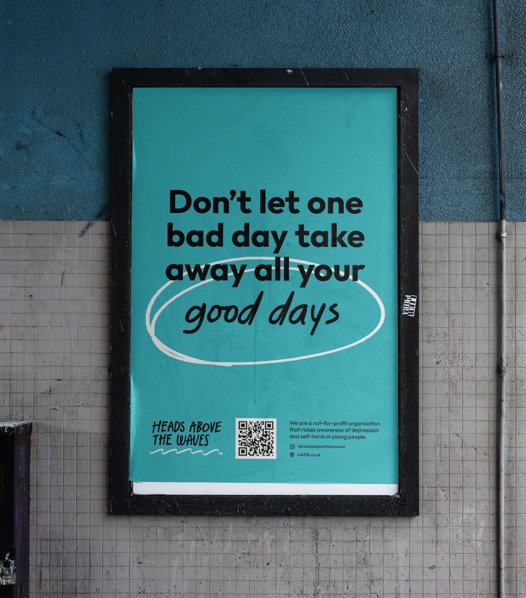
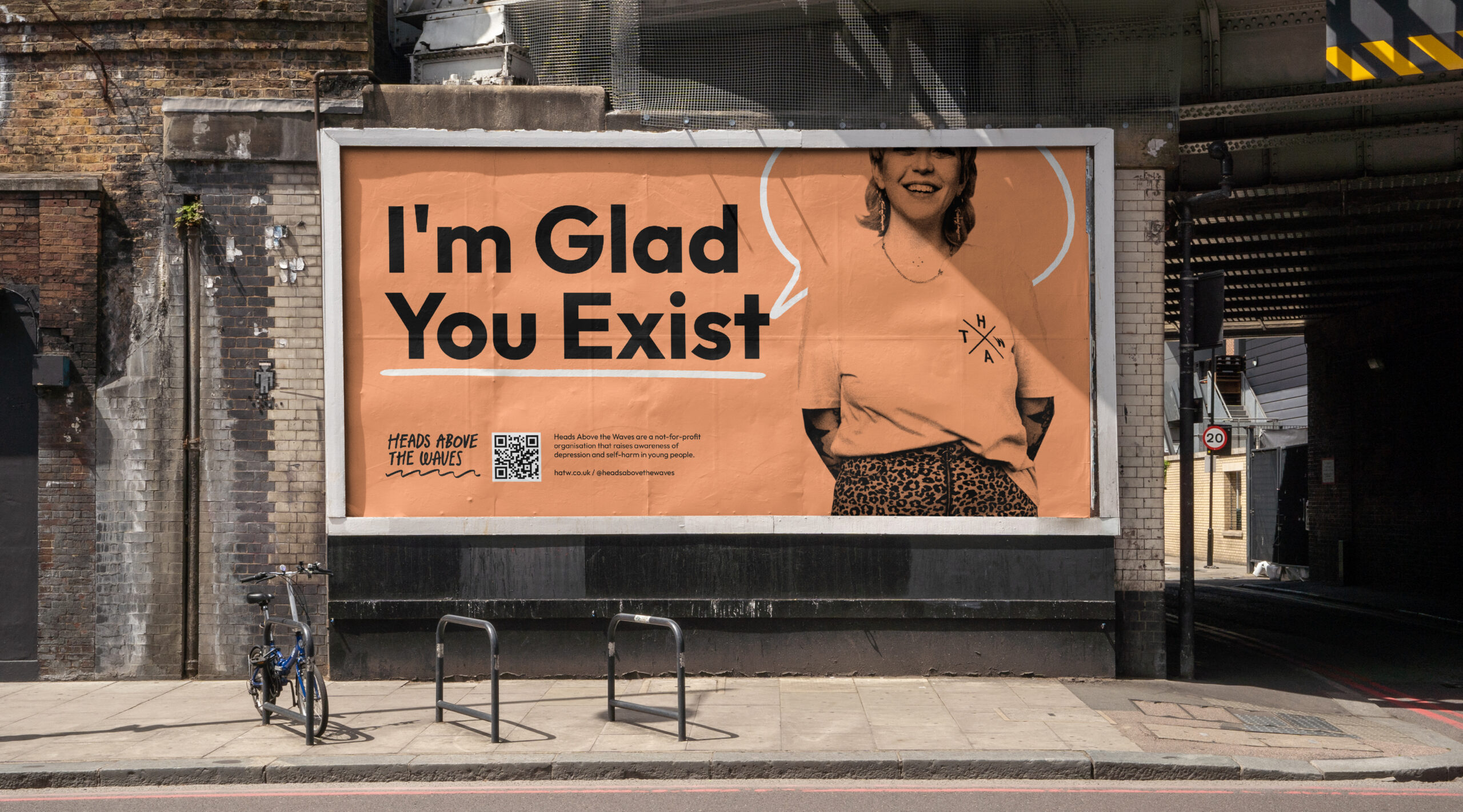
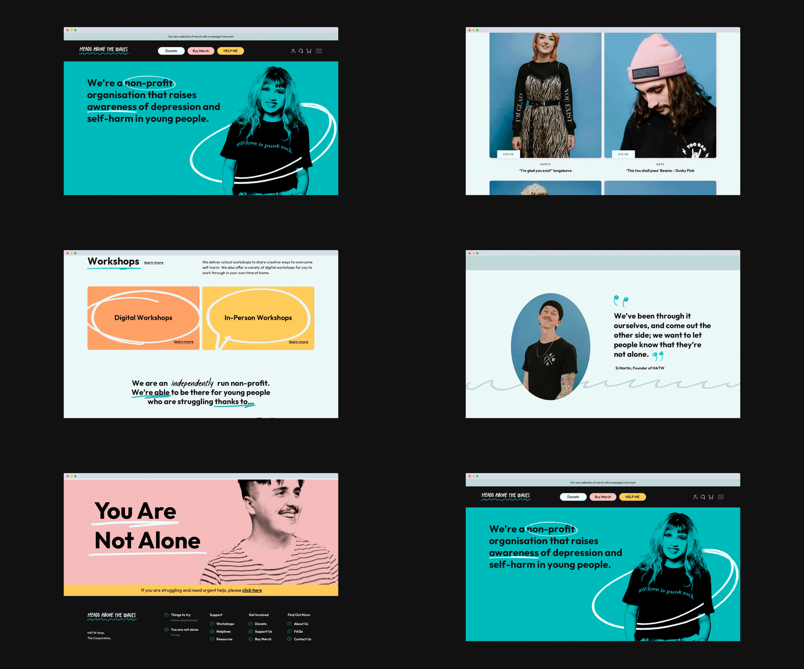
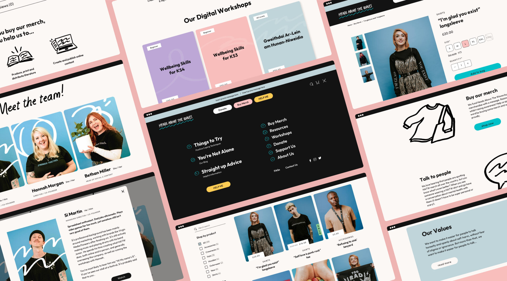
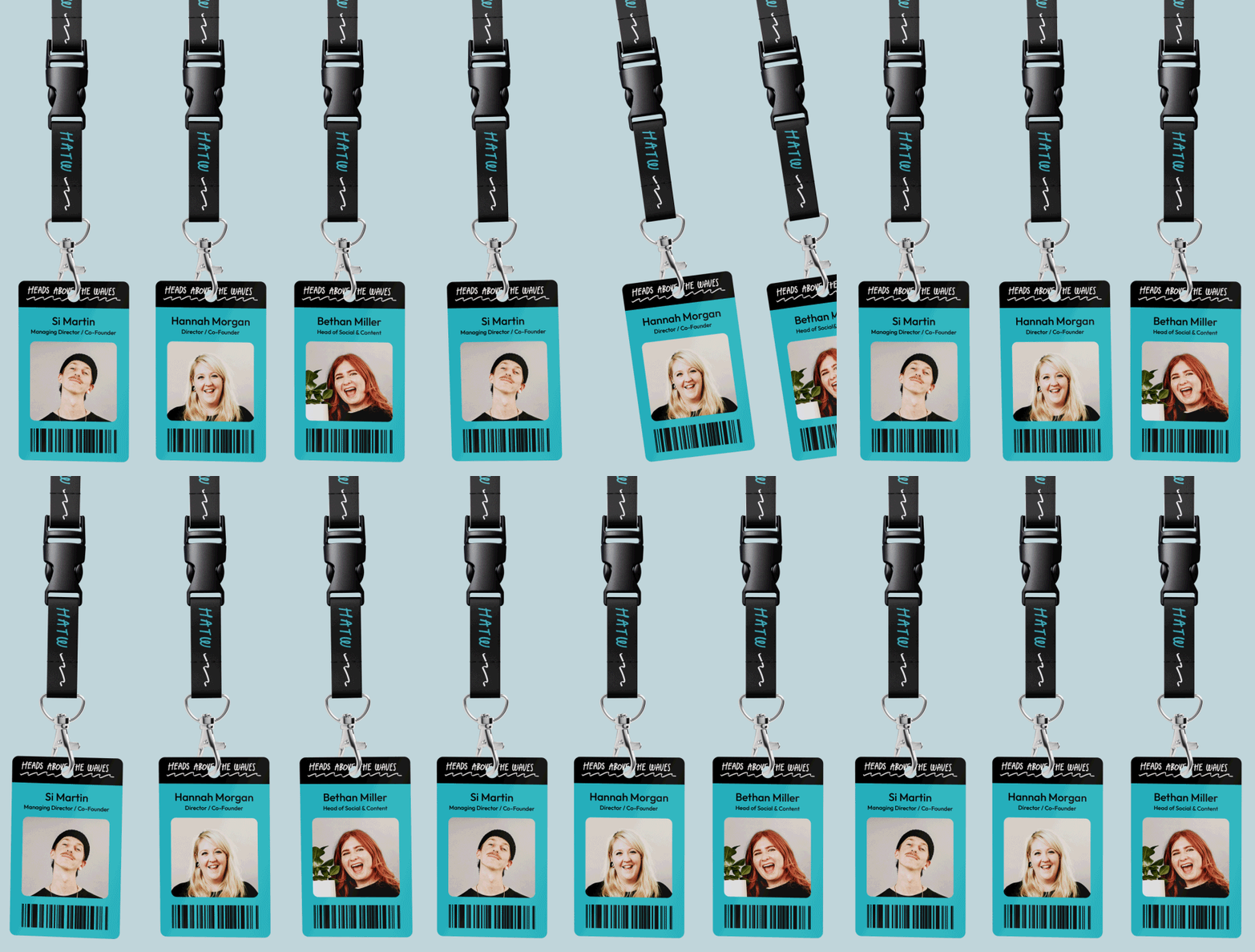
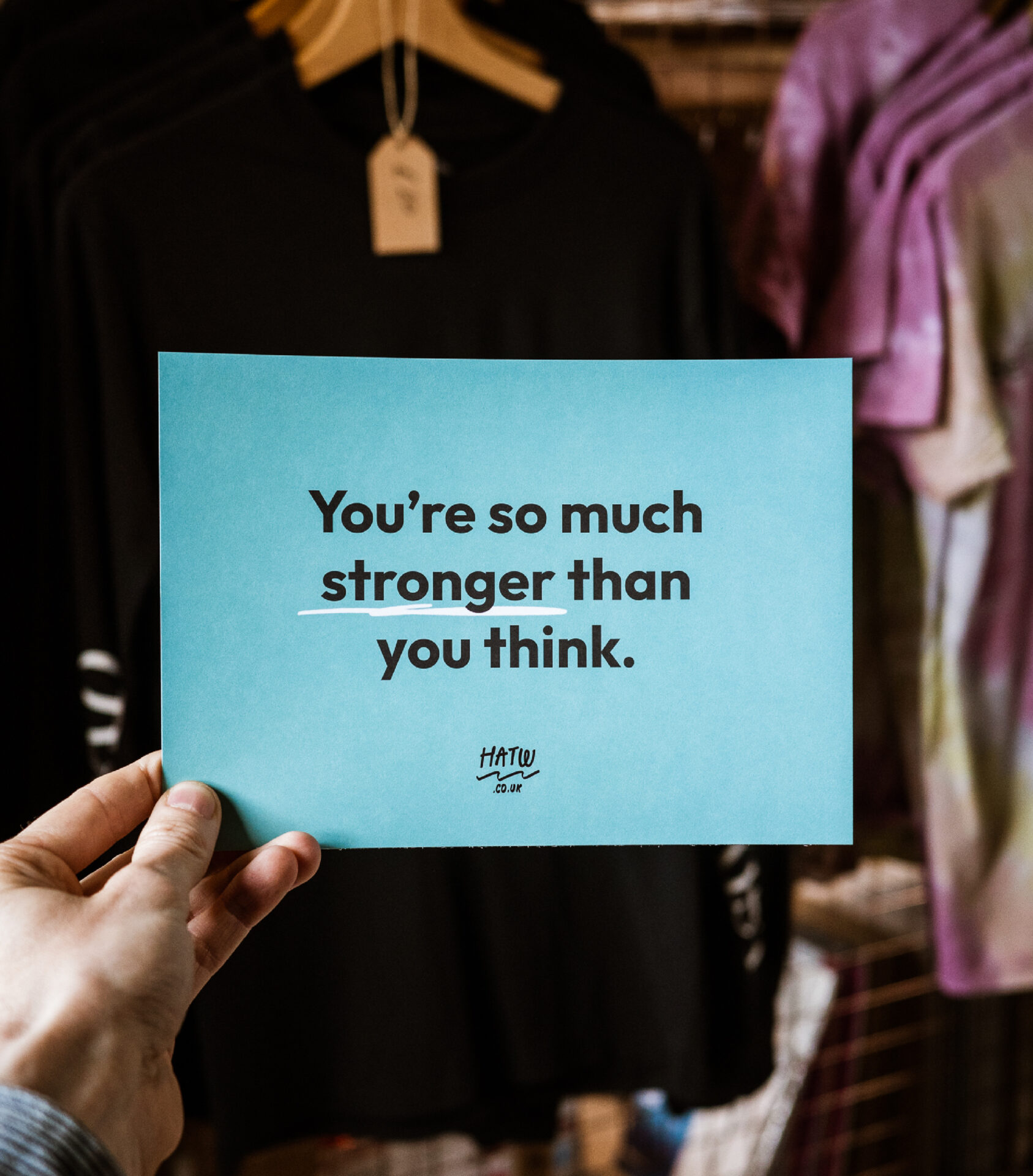
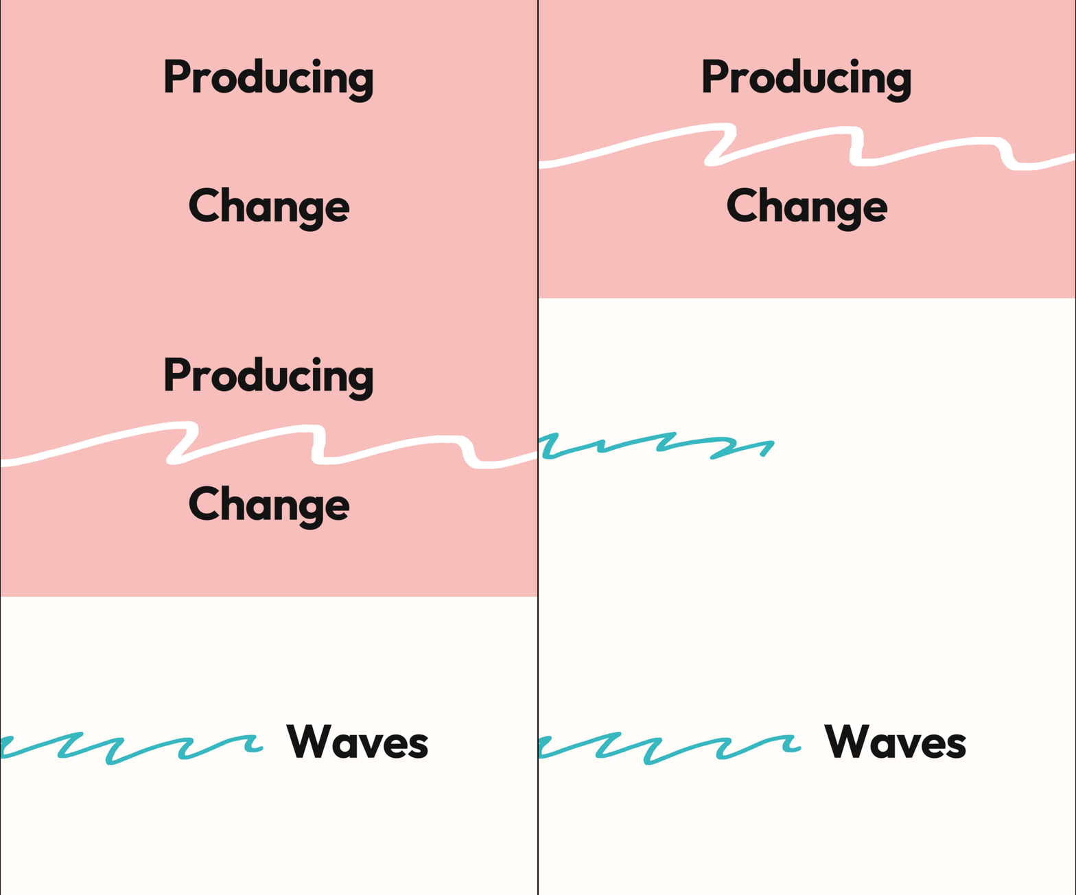
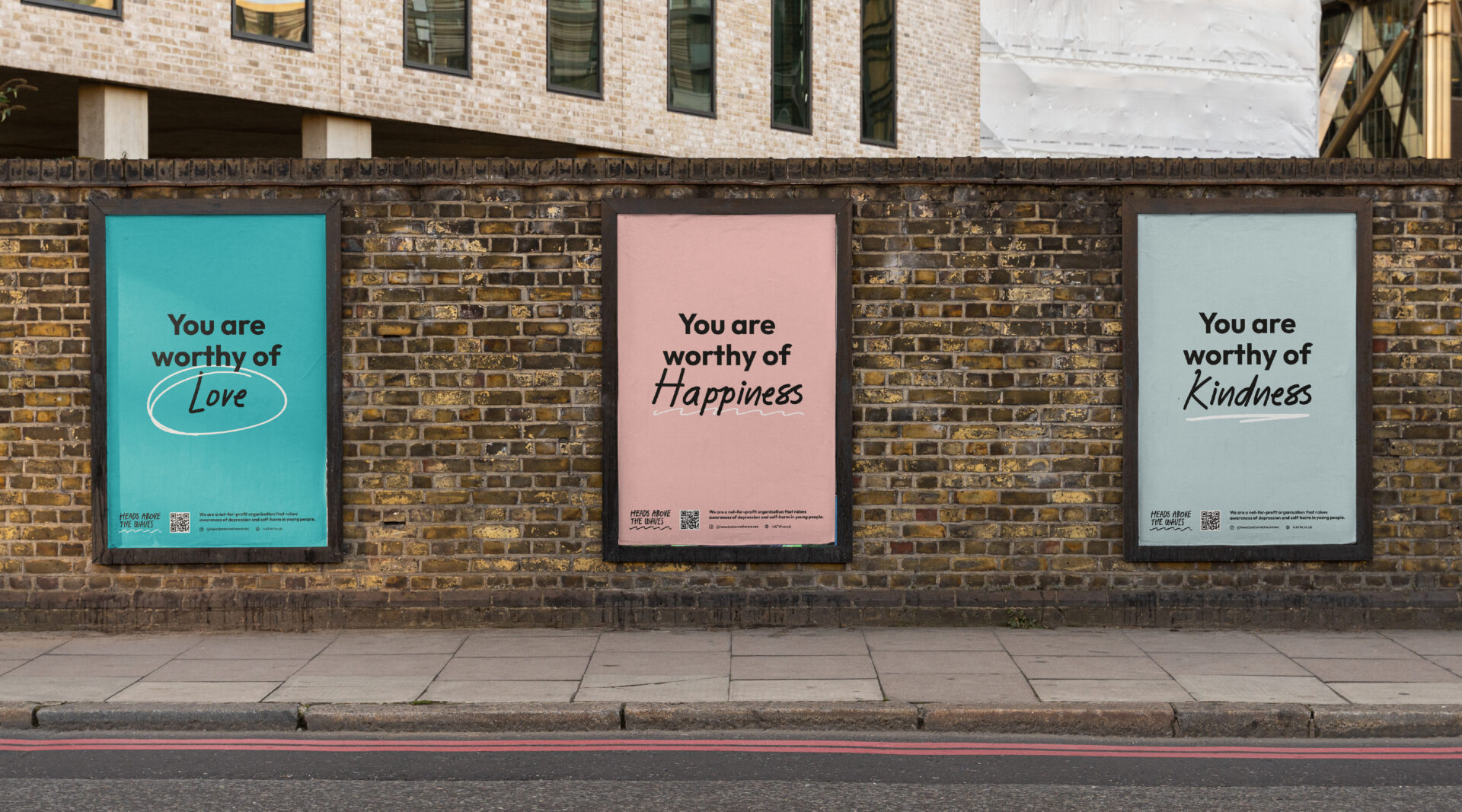
Following extensive research we introduced a new approach to HATW’s brand, creating a visual identity that reflected young people’s needs in a contemporary, unique and individual way, one that reflected their authentic voice and experience. We need to apply the outcomes to an array of spaces, from the building of a new website, focusing on social media to promote their messaging and informative content effectively to applying the identity to print, merchandise, packaging, workshop documents and shop signage.

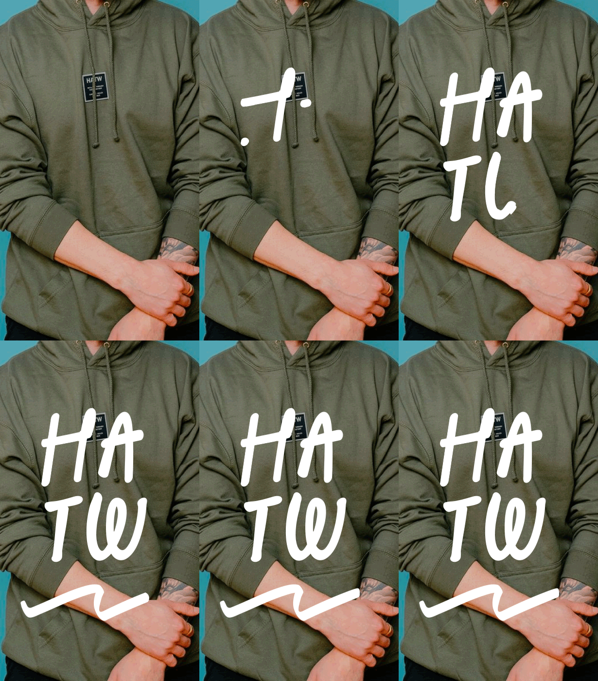
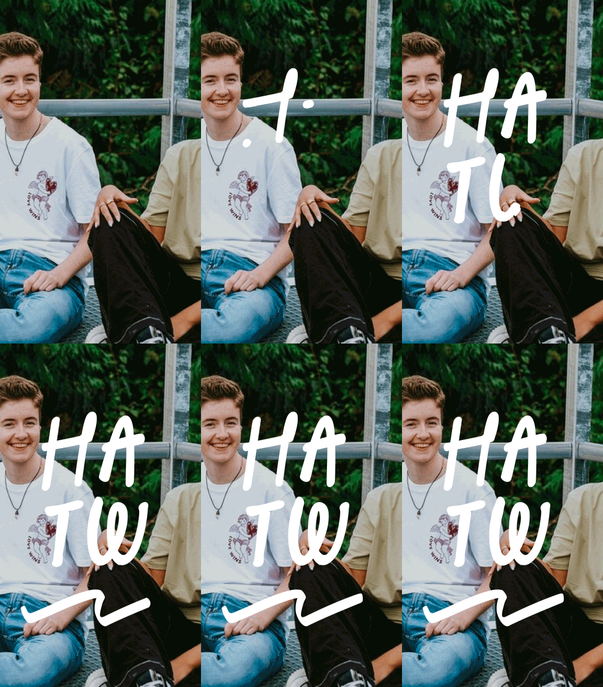
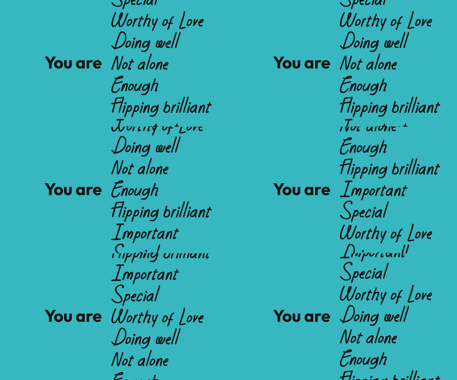
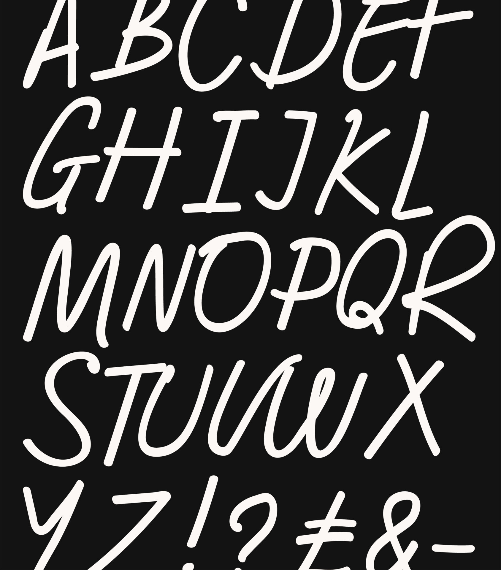
We wanted to include Si, Hannah and Bethan’s personality in the brand by including a hand written script font. Being lead by the idea of the HATW team adding hand written notes in orders and jotting down on work sheets, we soon realised an pre existing font wasn’t going to be personable and bespoke enough. Inspired by the style of the font Bright Clones and the individual styles of the teams handwritting we got to work on producing ‘HATW Script’ – a bespoke brand font.

You can read more about our process for creating this font here.

We had a great time working with white sky. They helped us look at our whole business in a new way, and then brought that new vision to life with the new brand. We threw them a giant project and they handled it with patience, diligence, and we knew they were on our side through the whole thing.

Si, HATW Founder
Work with us

We’re always open for a chat, so get in touch to find out how we can help.

Let's talk