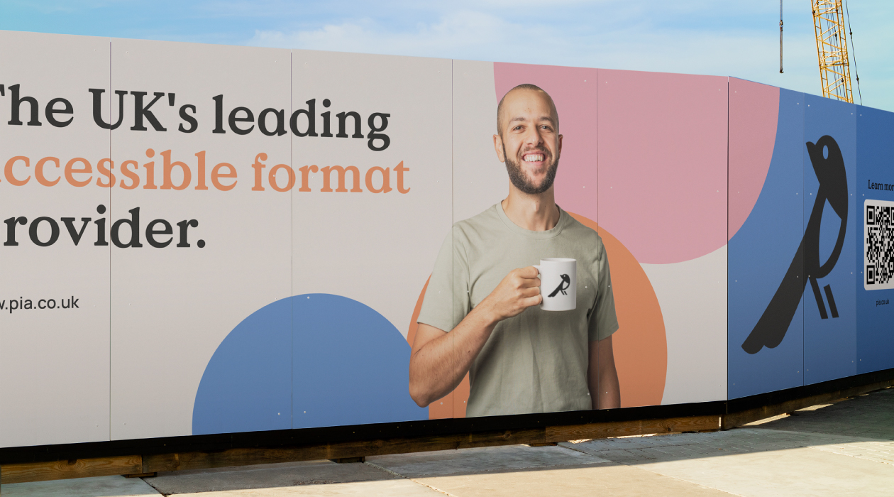
Pia are the UKs leading independent accessible format provider and are committed to delivering high quality braille, large print and audio to ensure individuals get information that they can access.
We were approached to support them with modernising their corporate image which hadn’t been updated in over 20 years. Tasked with the responsibility of crafting a new brand identity to reflect their story and personality and also to build consistency and clarity across all applications.
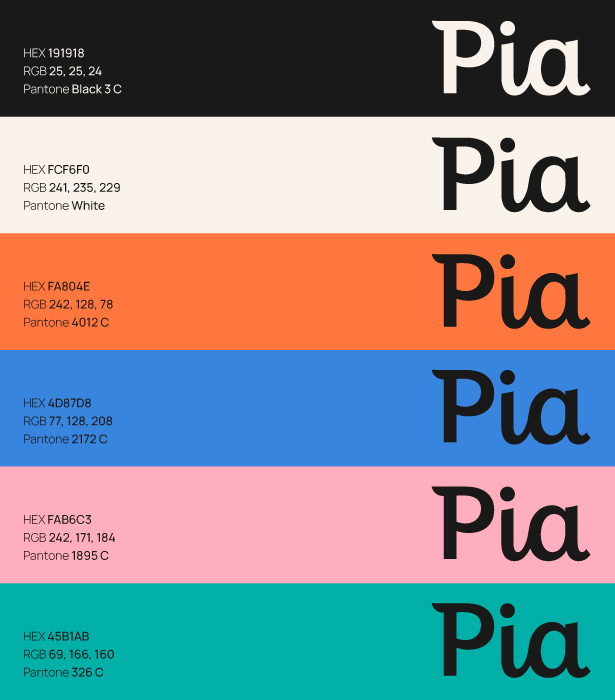
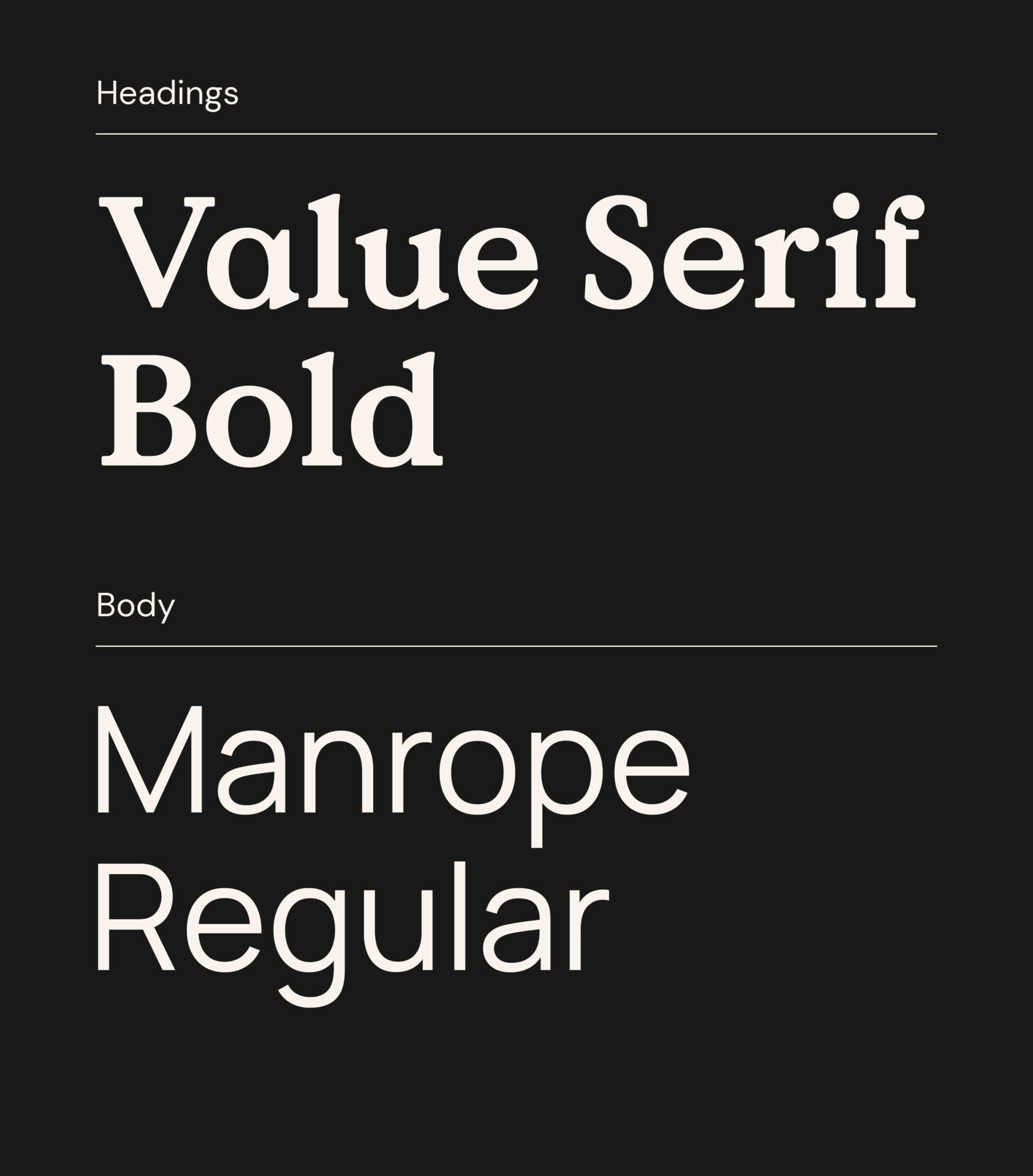
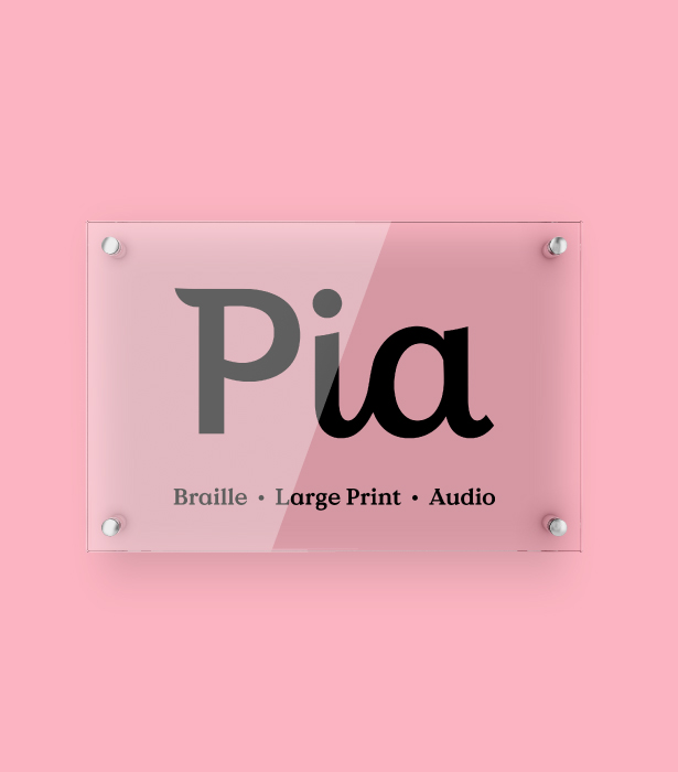
Being a leader in providing accessible formats, it was paramount we built a brand that was legible, functional and accessible. Throughout the process we carefully tested typefaces and used Adobe’s colour accessibility tools for contrast checks and to detect colour conflicts that could potentially cause confusion for those with colour blindness. We were then able to clearly outline these results in the brand guidelines document to ensure anyone who worked with it in future would understand the importance of accessibility.
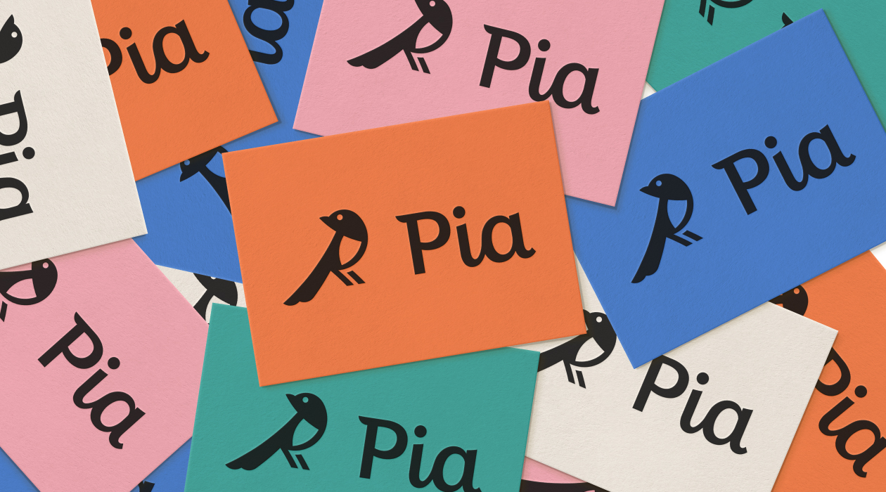
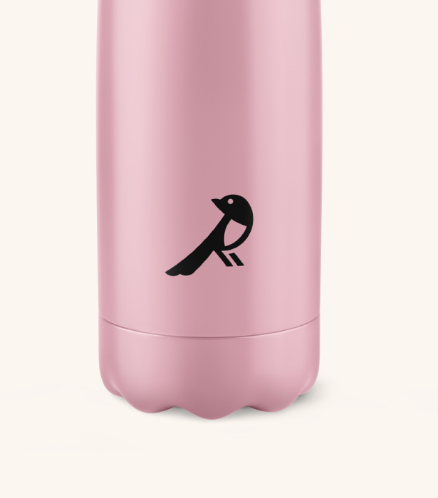
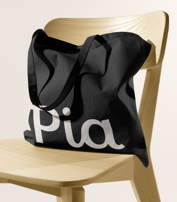
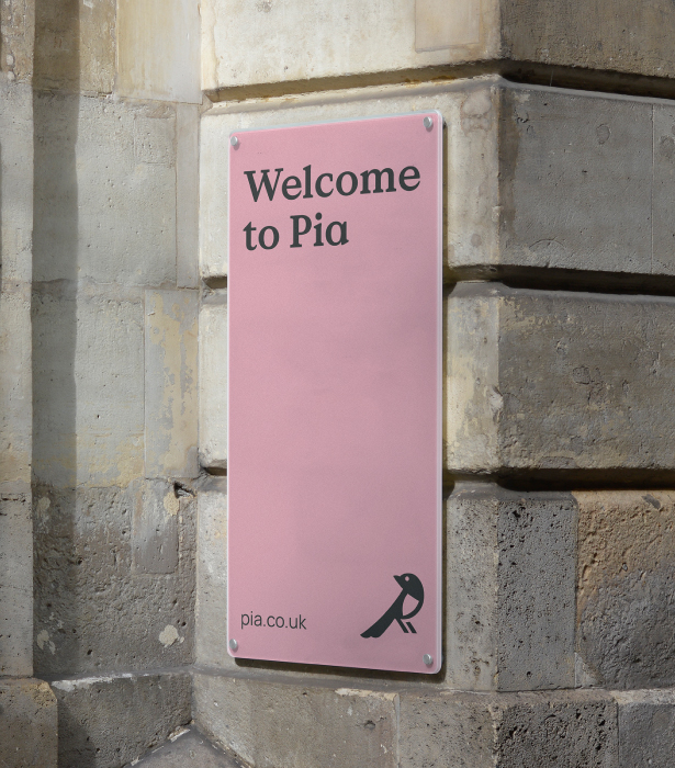
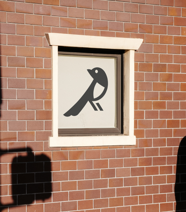
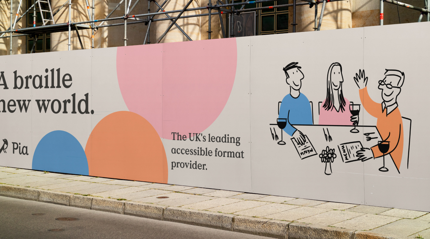
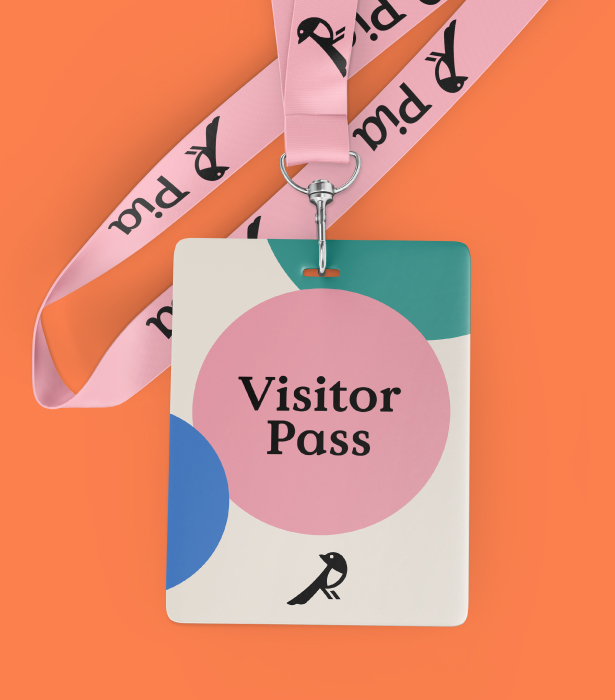
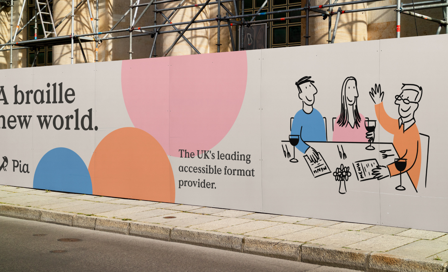
Pia’s company symbol was a magpie and had become a part of their strong company image over the past twenty years, so it was important we didn’t stray away from this fundamental part of their brand. Our aim was to simplify and modernise the magpie and as we developed concepts alongside a logotype, we focused on pairing the two with subtle design links. We took curves and points from the Magpie marque and worked them into the brand’s wordmark to create a link between the two.
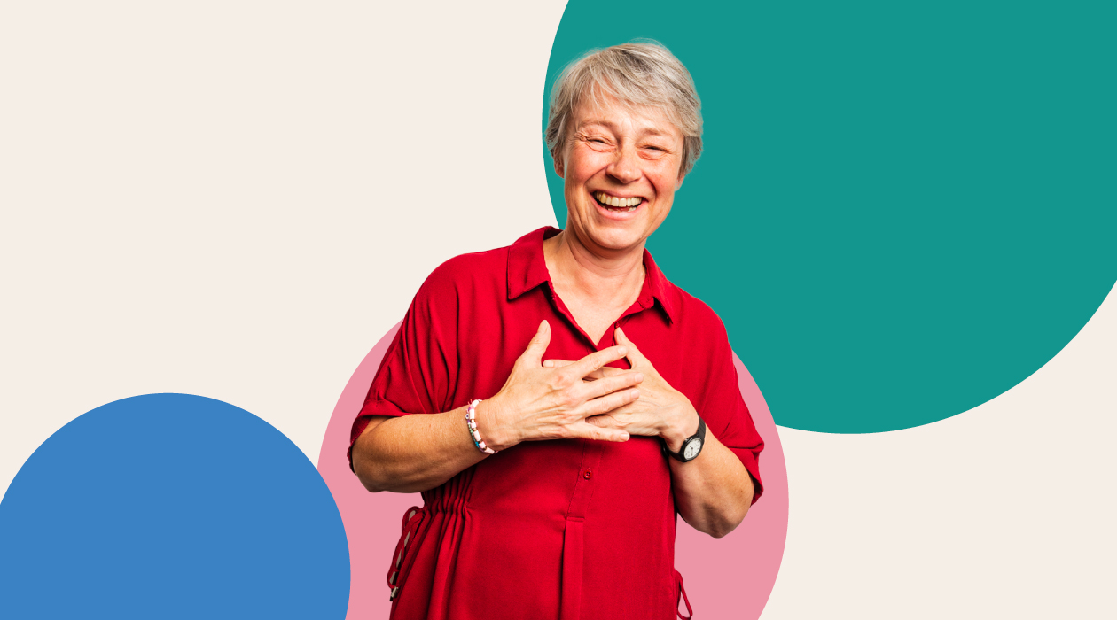
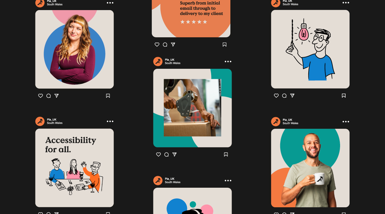
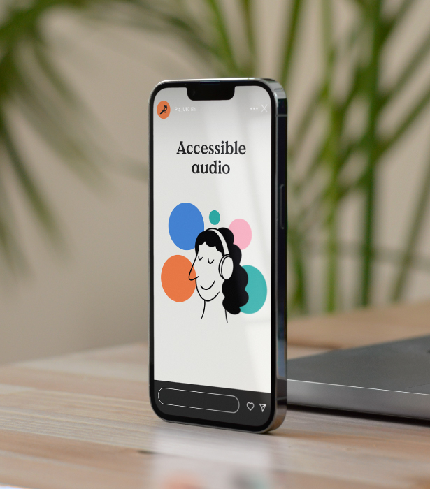
As we moved onto the wider brand, we developed a circular based design system which provided vibrancy and energy. The use of circles created an opportunity to inject the brand palette into a wide variety of applications as well as creative versatility to keep the brand’s usage varied and engaging. We explored a wide range of brand style applications to demonstrate its potential across print and digital, ensuring the uses were both visually effective and easy for Pia’s team to replicate and work with moving forward.
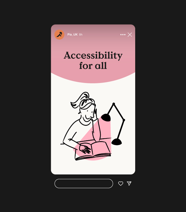
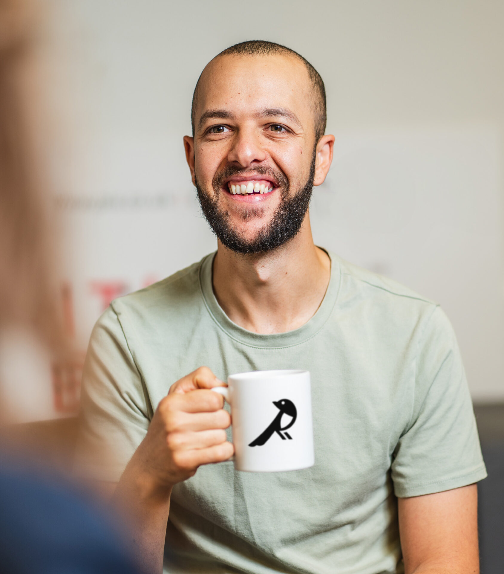
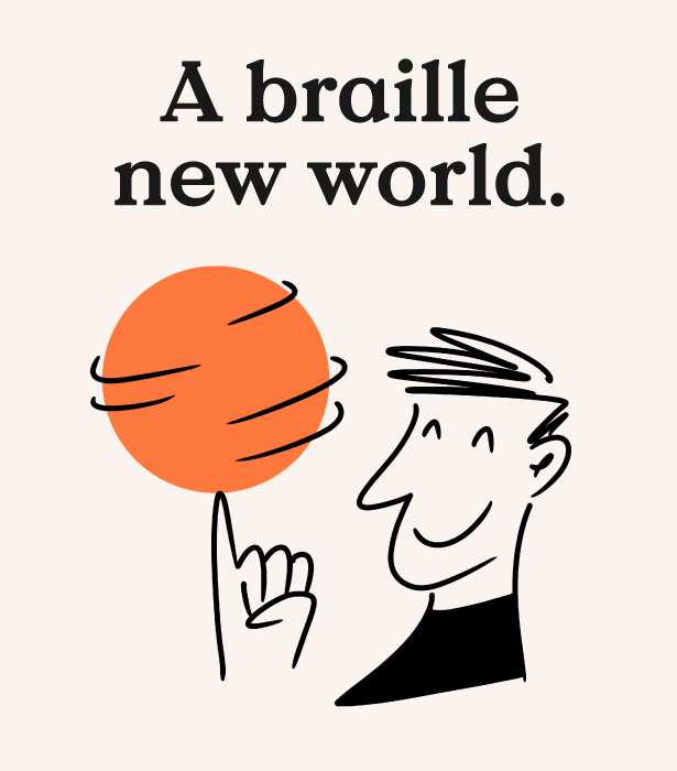
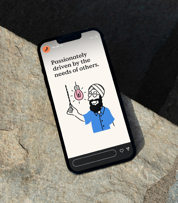
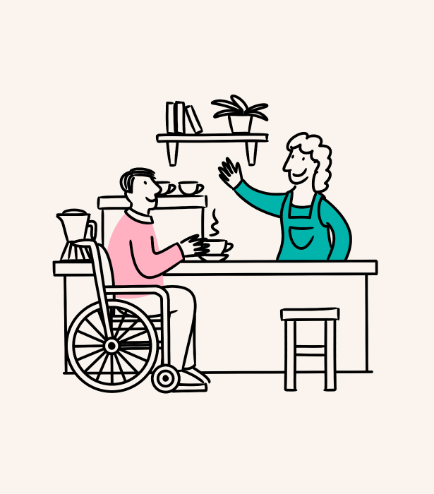
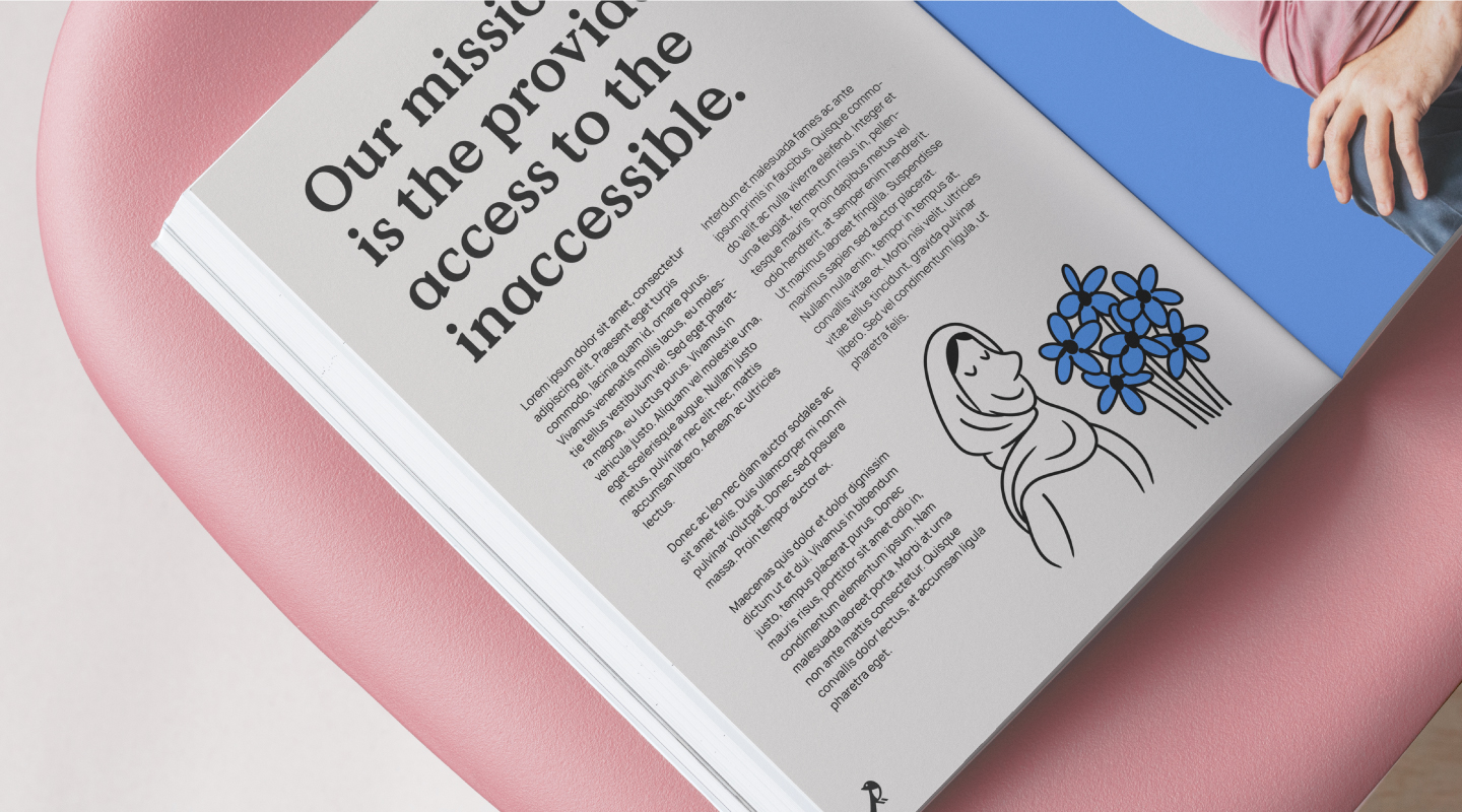
To add additional personality to the brand we developed an illustration and character style with Illustrator Emma Baker. Also, to further champion Pia’s team, we worked with photographer Tom Parsons to capture team headshots to feature alongside the company’s new identity.