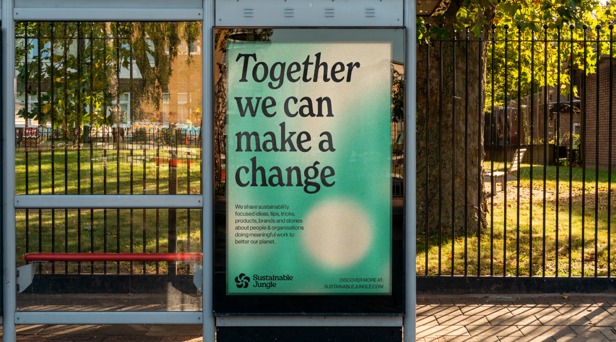
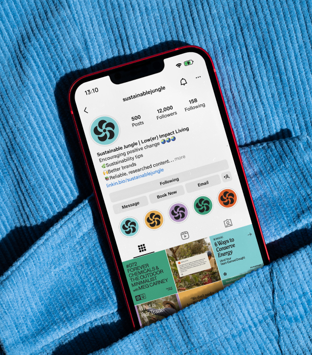
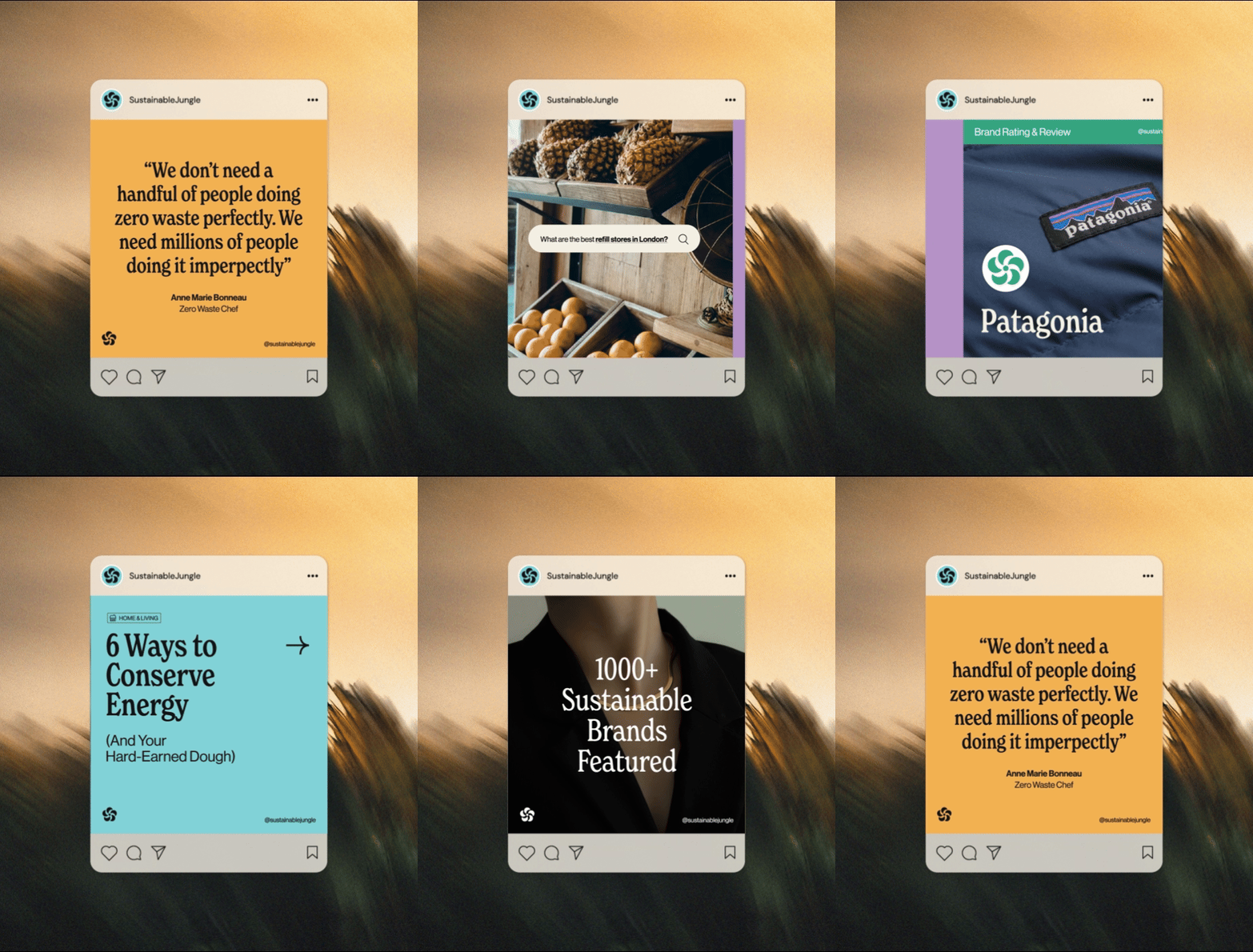
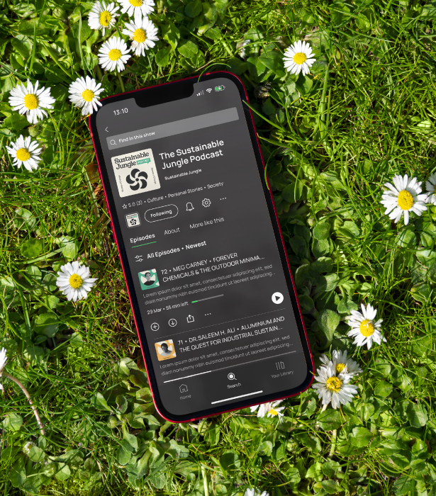
Since their founding in 2017, Sustainable Jungle (SJ) has been dedicated to promoting brands and products that contribute to a healthier planet, guiding thousands of people to make meaningful lifestyle changes and more conscious purchasing decisions.
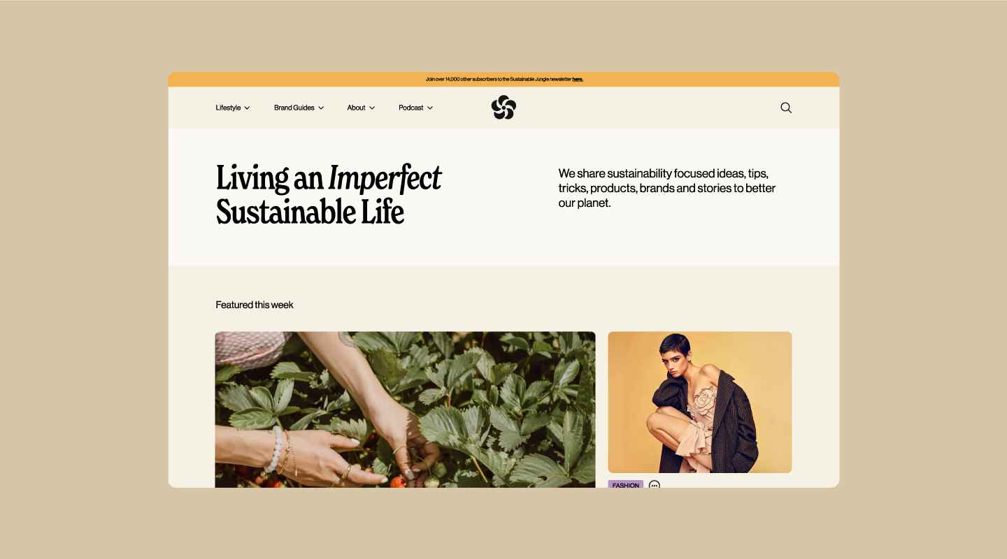
To support their continued growth and expand their reach, SJ sought a revitalised brand identity, an updated website, and the introduction of a sustainable brand rating system.
At its core, SJ is an authentic and approachable platform. They recognise that widespread change comes from millions of individuals making small, manageable shifts in their daily habits, rather than expecting perfection. Their motto, ‘Living an imperfect sustainable life,’ reflects this philosophy. With this in mind, the new brand and website needed to convey accessibility and warmth. Rather than calling out harmful brands or inducing guilt, SJ focuses on celebrating positive steps and empowering consumers with choices that align with their values.
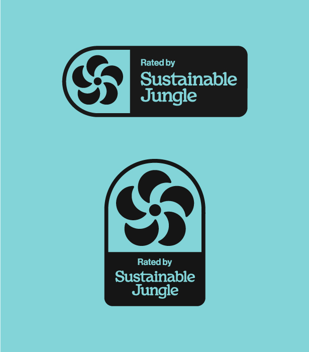
Throughout the development of the brand and website, we carefully considered the requirements for the new rating system. Initially, the plan was to create a standalone visual identity for the rating, but we encountered several challenges. The symbol needed to be distinct and original to Sustainable Jungle while also being instantly recognizable and easy for users to understand at a glance.
We wanted to avoid the typical thumbs up/thumbs down or 1-5 star ratings, but we also had to ensure that some of our more unconventional concepts remained clear and intuitive. To strike this balance, we looked to established platforms like Trustpilot, Tripadvisor, and Rotten Tomatoes, where the rating systems are tightly integrated with the company’s brand. These systems give the impression that the company is personally endorsing the rated content – a mark of approval they are confident in standing behind.
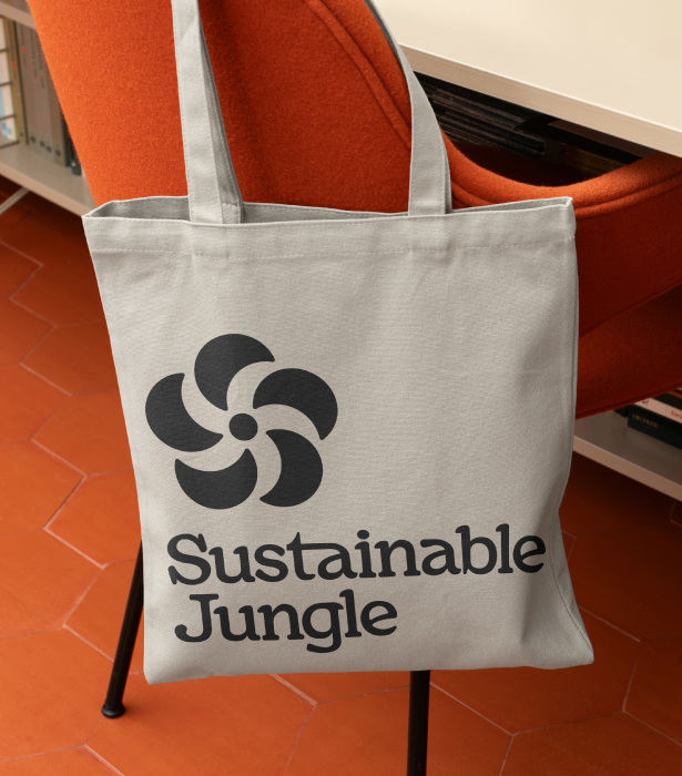
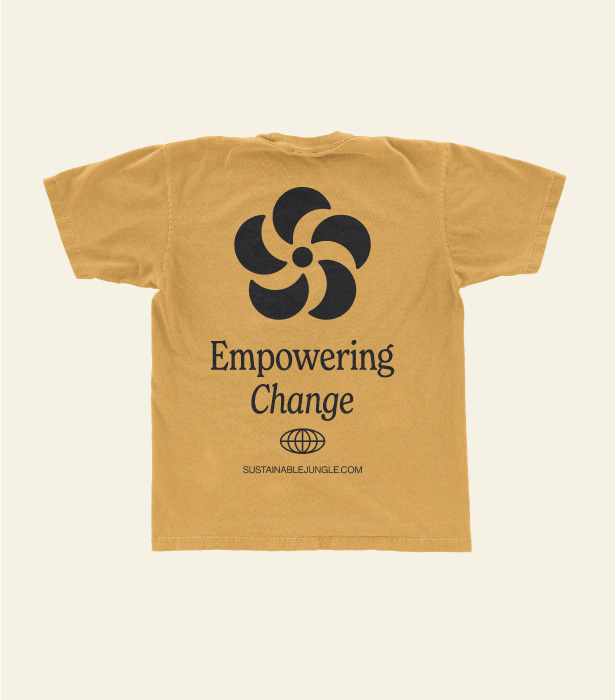
After exploring various tropical flower shapes to tie directly to the “jungle” theme and convey a sense of positivity, we refined the design to a simple five-petal flower. This shape became the foundation of the 1-5 rating system. The symbol proved versatile, working seamlessly across all applications as a prominent logo mark. It was then integrated into the brand rating pages on the website, ensuring consistency and harmony between the overall brand identity and this new rating feature.


