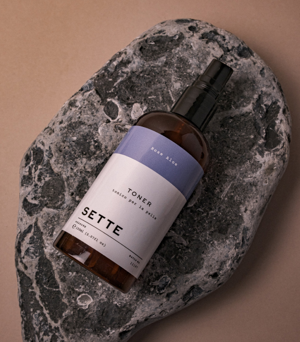
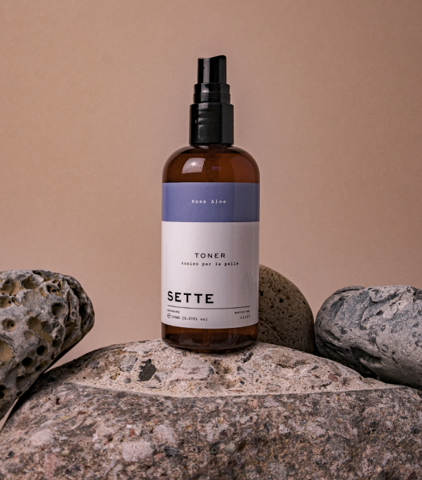
Through a culmination of experience in the skincare industry and suffering from severe acne as a teenager, Lisa from Sette created a range of products for everyone to add a little self-care to their everyday.
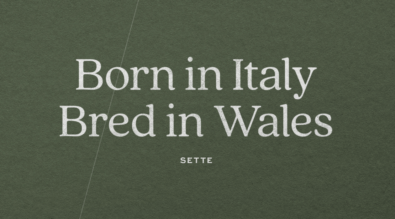
The brand is inspired by Lisa’s grandad, Settimio, who would harvest fruit and vegetables on the family farm in Italy, creating delicious recipes and homemade remedies for hygiene, illnesses and day-to-day wellbeing.
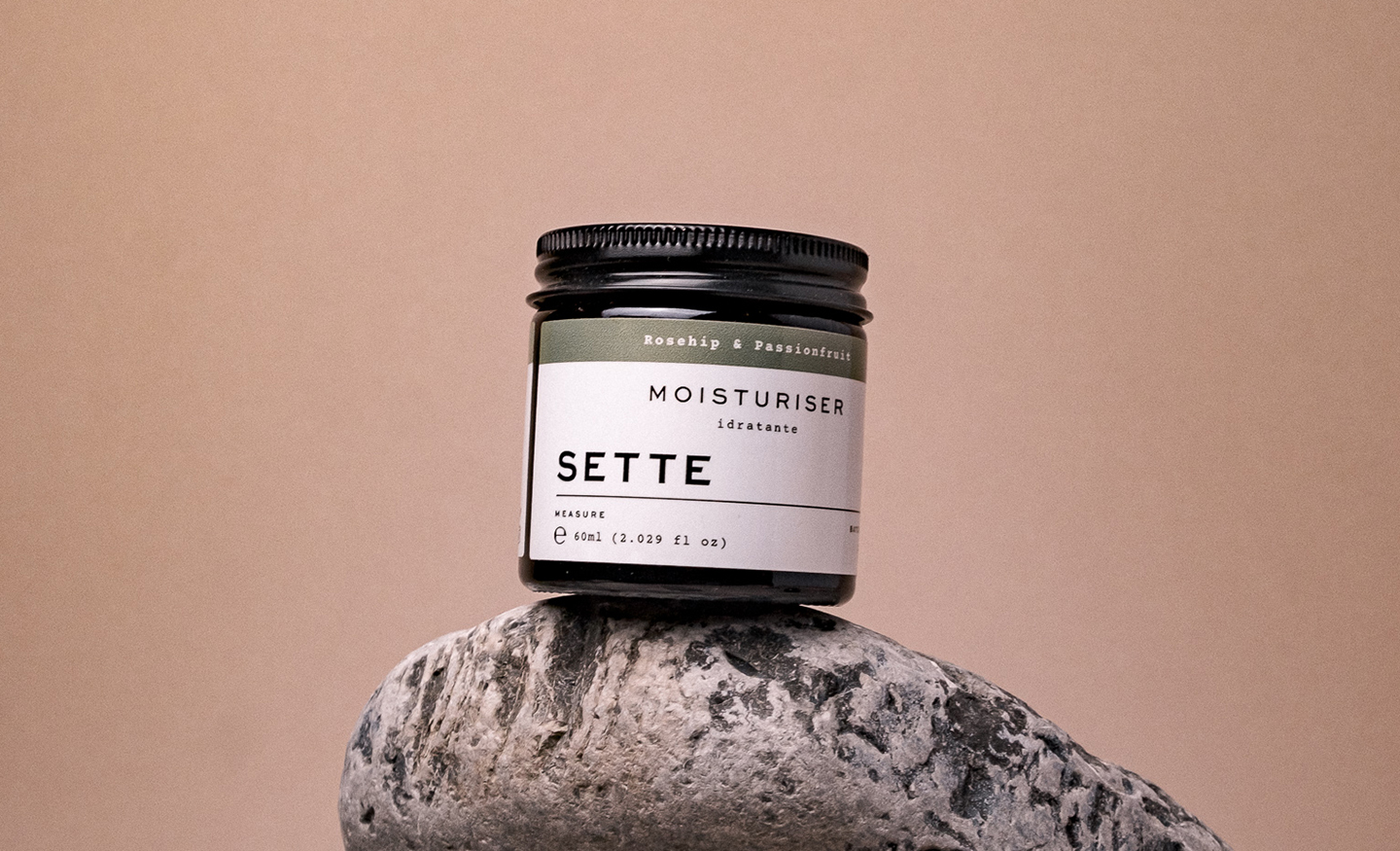
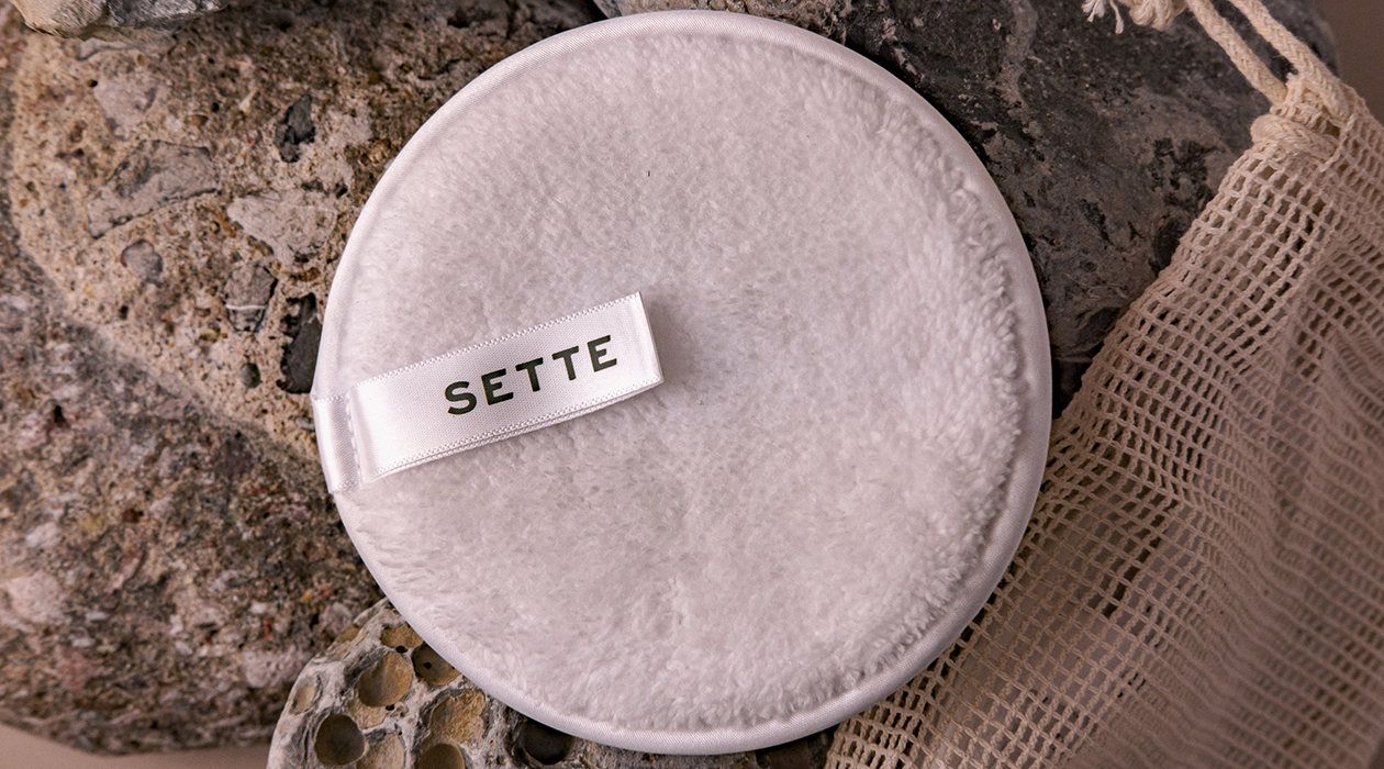
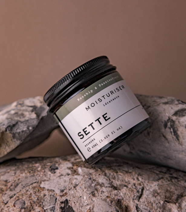
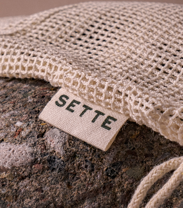
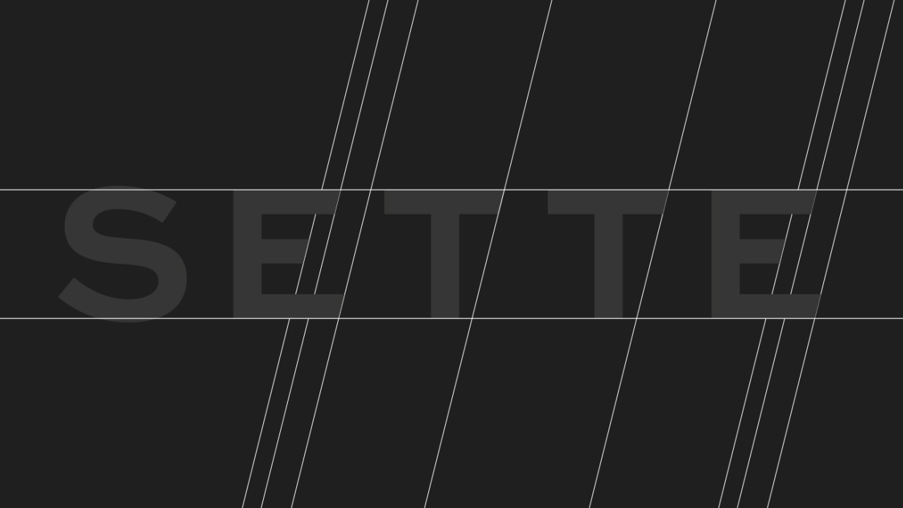
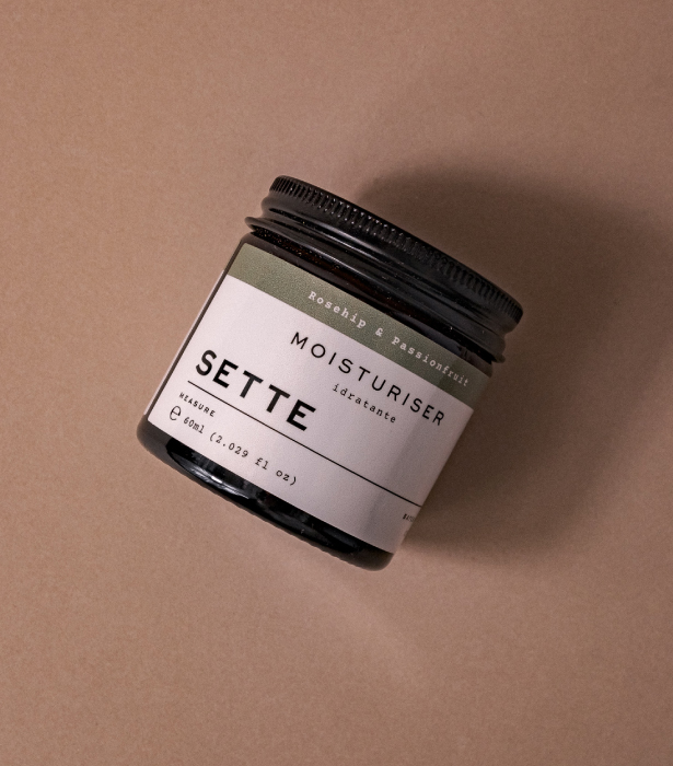
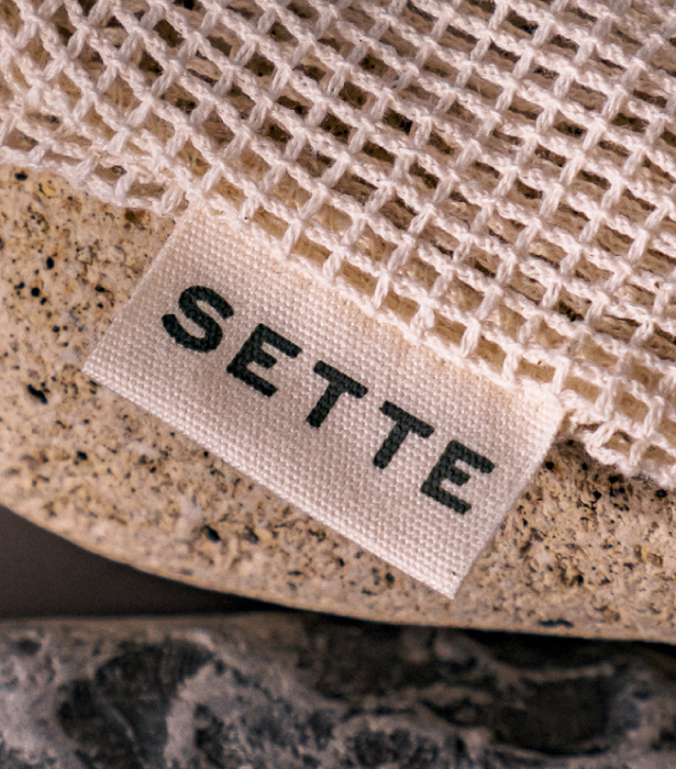
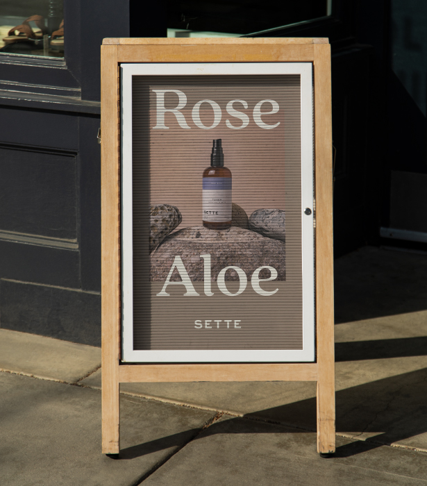
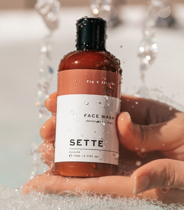
Our approach began with understanding the distinct relationships with family and heritage and formalising a visual identity that would carry this message, taking inspiration from Italian styles, colours and down to earth nature of the mediterrian lifestyle. we incorporated the slanted shape of the number 7 within the logotype characters, providing a bespoke yet subtle feel for the identity. In the process defining a unique direction that is effortlessly stylish, refined, traditional but also considered modern lifestyle for the audience.

